“Our goal was to do justice to the universe of sweets: something happy and full of life. Eating a sweet is always a moment of pleasure, so we tried to bring, together with the logo, a language for the communication pieces with lots of colors and elements that represented an 'explosion of flavors', something alive and dynamic”


The Naming project sought to bring an informal and inviting character to the project. And we found in "Meu Plano D" the ideal combination of meanings for those looking for practical alternatives to generate income – and why not with something that is also literally delicious to make? We also add the signature “making a living of candy” that ties the whole concept together.
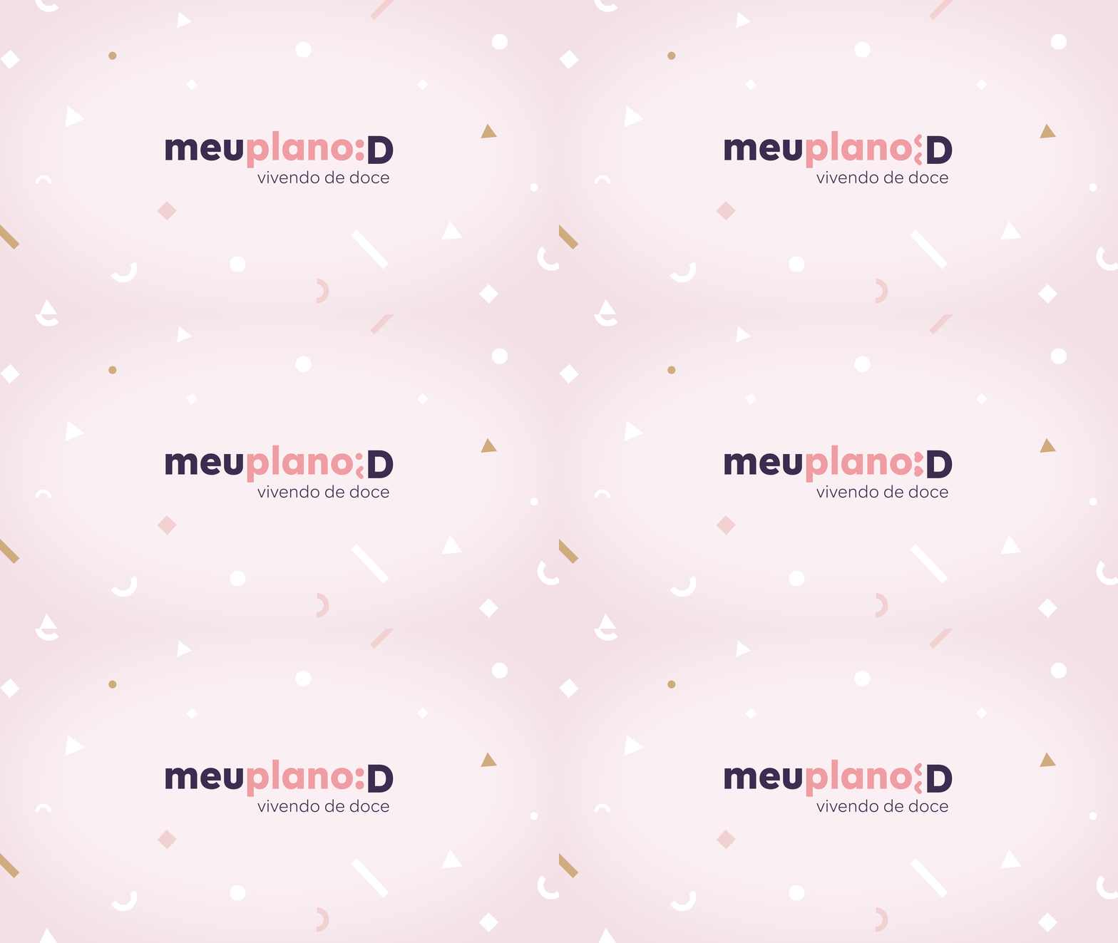
Regarding the visual identity, we analyzed the world of online platforms to arrive at a language that made sense to the public. It needed to be simple, direct, versatile, very digital and have a “what” of spontaneity. We found in the letter “D” a perfect element to play with and bring the brand to the digital universe, recreating emoticons. D is for candy, but it's for smile too. After all, it is the realization of a new plan that, we hope, works out.
The starting point for the art direction of Meu Plano D was the fact that it was necessary to create an identity that spoke to what Siamo Studio had already developed for Docepedia, the online content and recipe platform of the brands Selecta and Mix Ingredients .
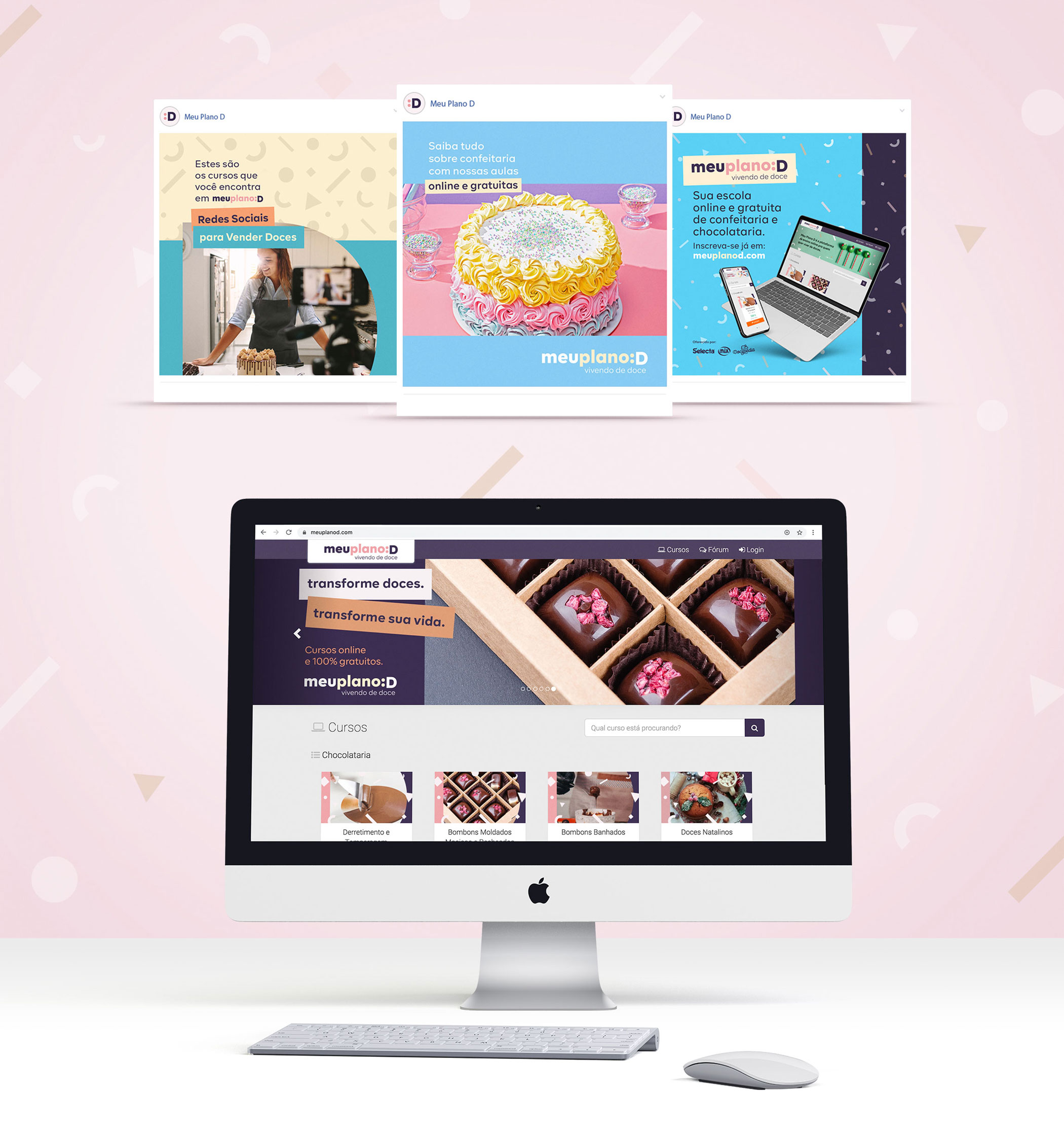
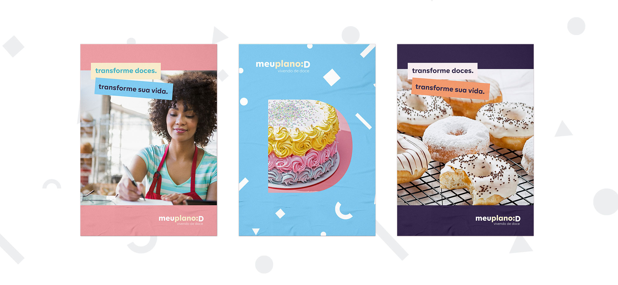
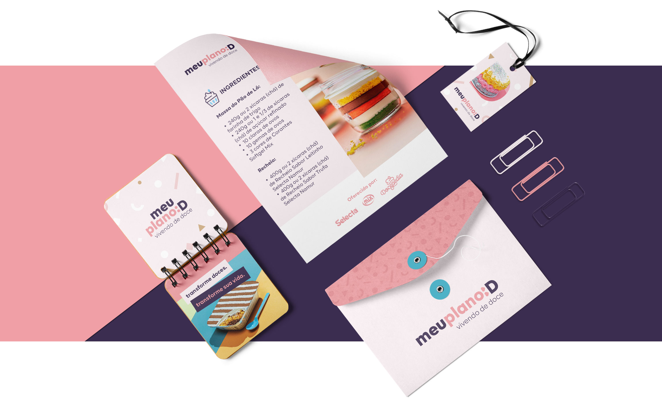
“Our second objective was to live up to the universe of sweets: something happy and full of life. Eating a sweet is always a moment of pleasure, so we tried to bring, along with the logo, a language for the communication pieces with lots of colors and elements that represented an “explosion of flavors”, to something alive and dynamic”, he says. Ana Paula Megda, creative director and founding partner of Siamo Studio.
After completing two years of life, the Meu Plano D Portal had more than 20 courses and 30,000 enrolled students.
The Meu Plano D platform was launched at the beginning of the pandemic period, connecting to the context of thousands of new entrepreneurs in search of training in this promising industry.
Year: 2020
Client: Selecta Chocolates/Duas Rodas
Planning, Brand Strategy and Naming: Pedro Cizoto
Art Direction: Ana Paula Megda
Design: Refael Busmayer e Fabiana Martins
Copywrite: Roberta Benzati
Motion Graphics Script: Estúdio Siamo
Motion Graphics animation: André Murched
Voiceover: Ana Paula Faria

