Okno Capital Branding

Branding project involving naming and visual identity, for specialists in investments and asset management in special situations.

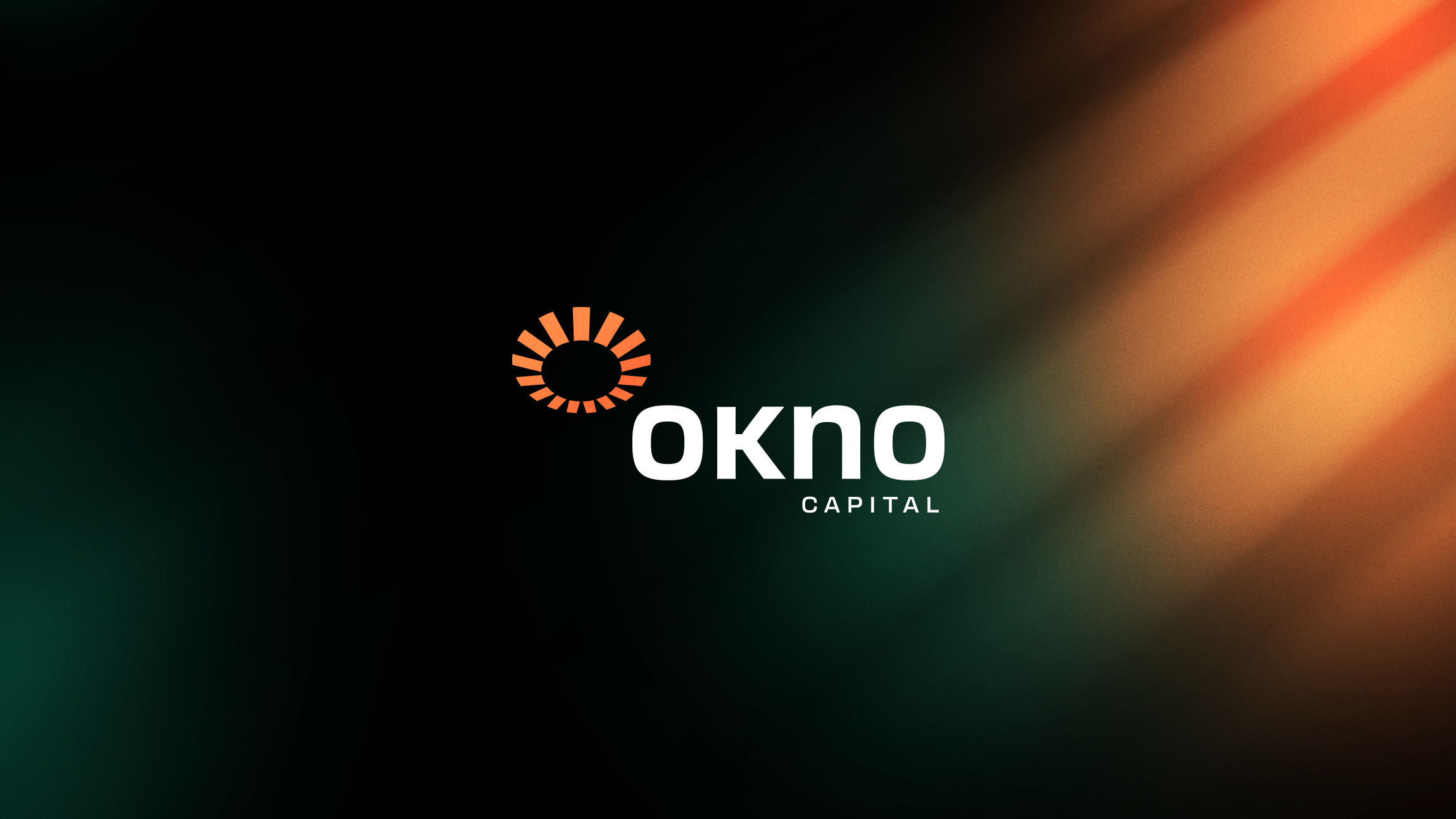
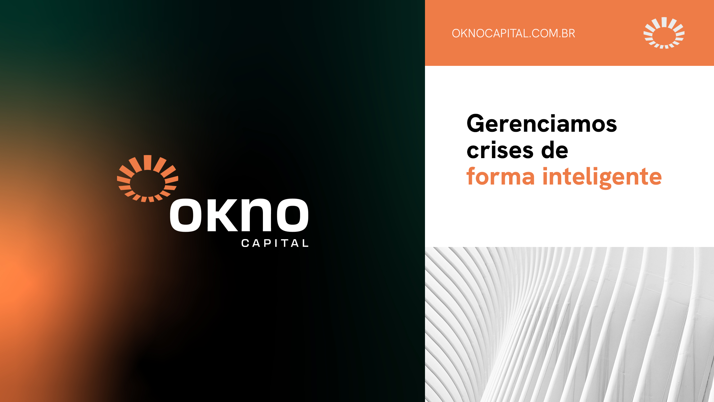
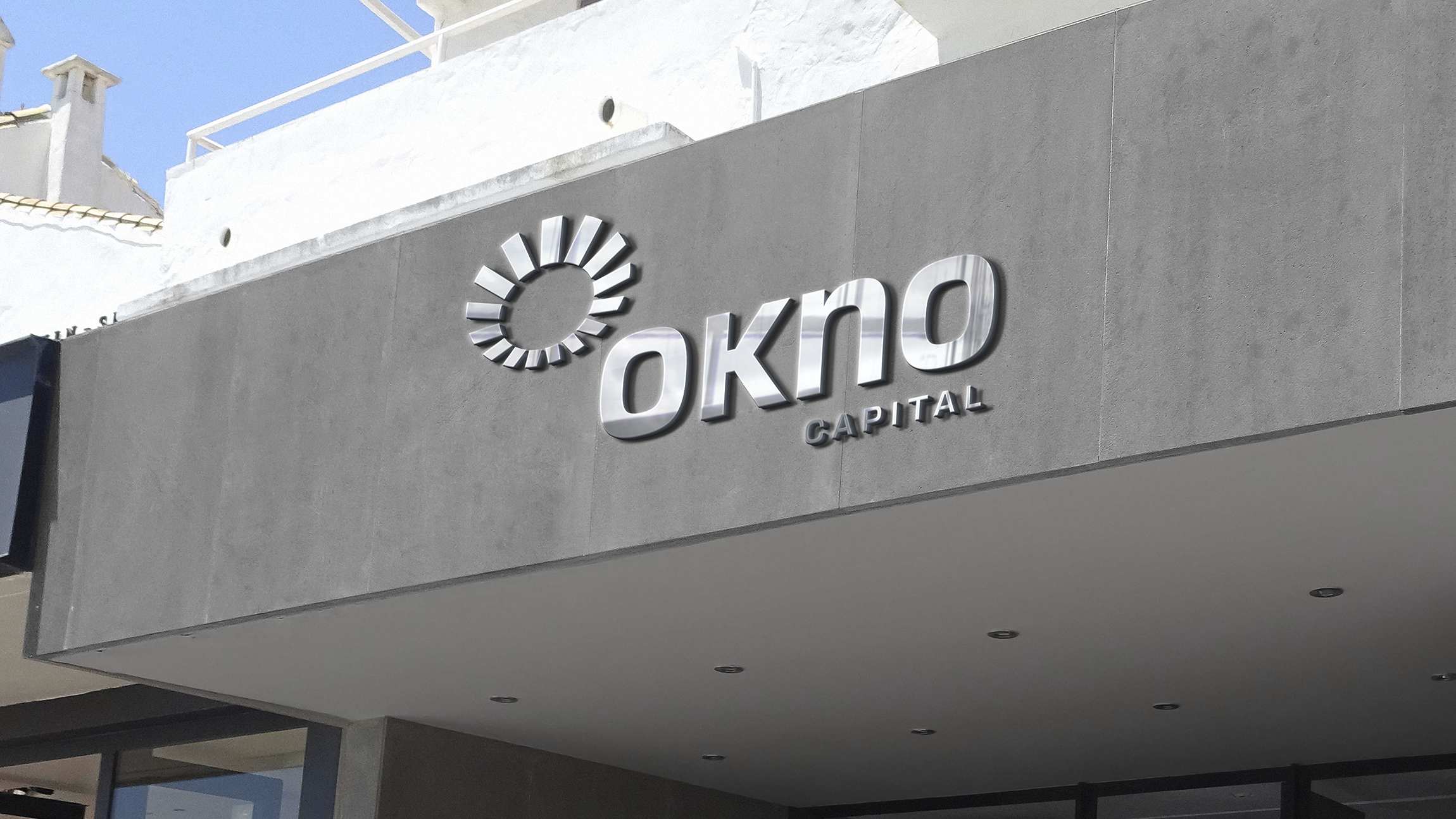
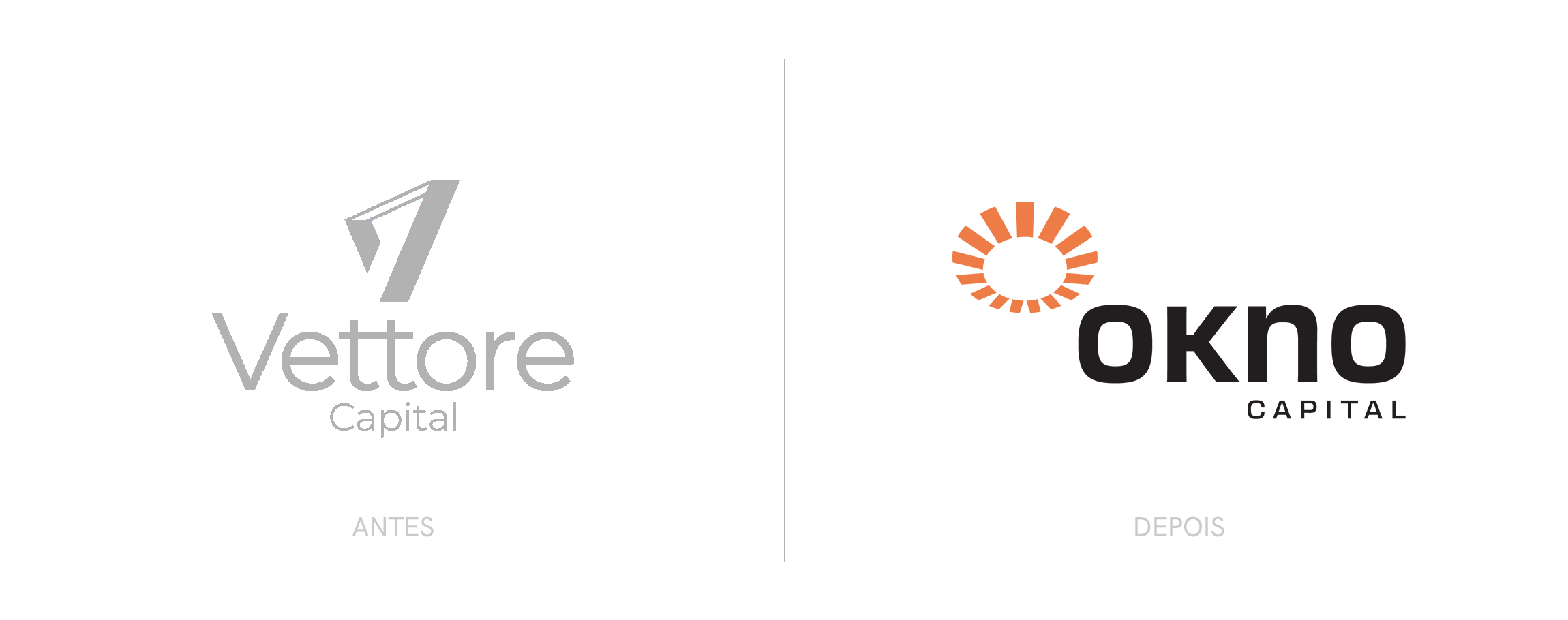
The logo features a symbol reminiscent of solar radiation, representing an opening to envision new horizons, combined with a font that conveys lightness and dynamism. 

Learn more about the project
Okno Capital is a firm specializing in investments and the management of special situation assets (distressed assets), headquartered in São Paulo.
Considering the specific financial segment, which focuses on debt restructuring and overcoming complex scenarios during times of crisis, the branding needed to reflect attributes such as security, expertise, performance, and the ability to reconcile interests. It also required a name that was registrable, memorable, coherent, and aligned with the company's positioning.
The naming process resulted in a short, sonorous, friendly name with numerous vowels, ensuring easy reading and pronunciation in different languages. The word "okno" means "window" in Polish, evoking a sense of ventilation and an opening to new possibilities.
The logo features a symbol reminiscent of solar radiation, representing an opening to envision new horizons, combined with a font that conveys lightness and dynamism.
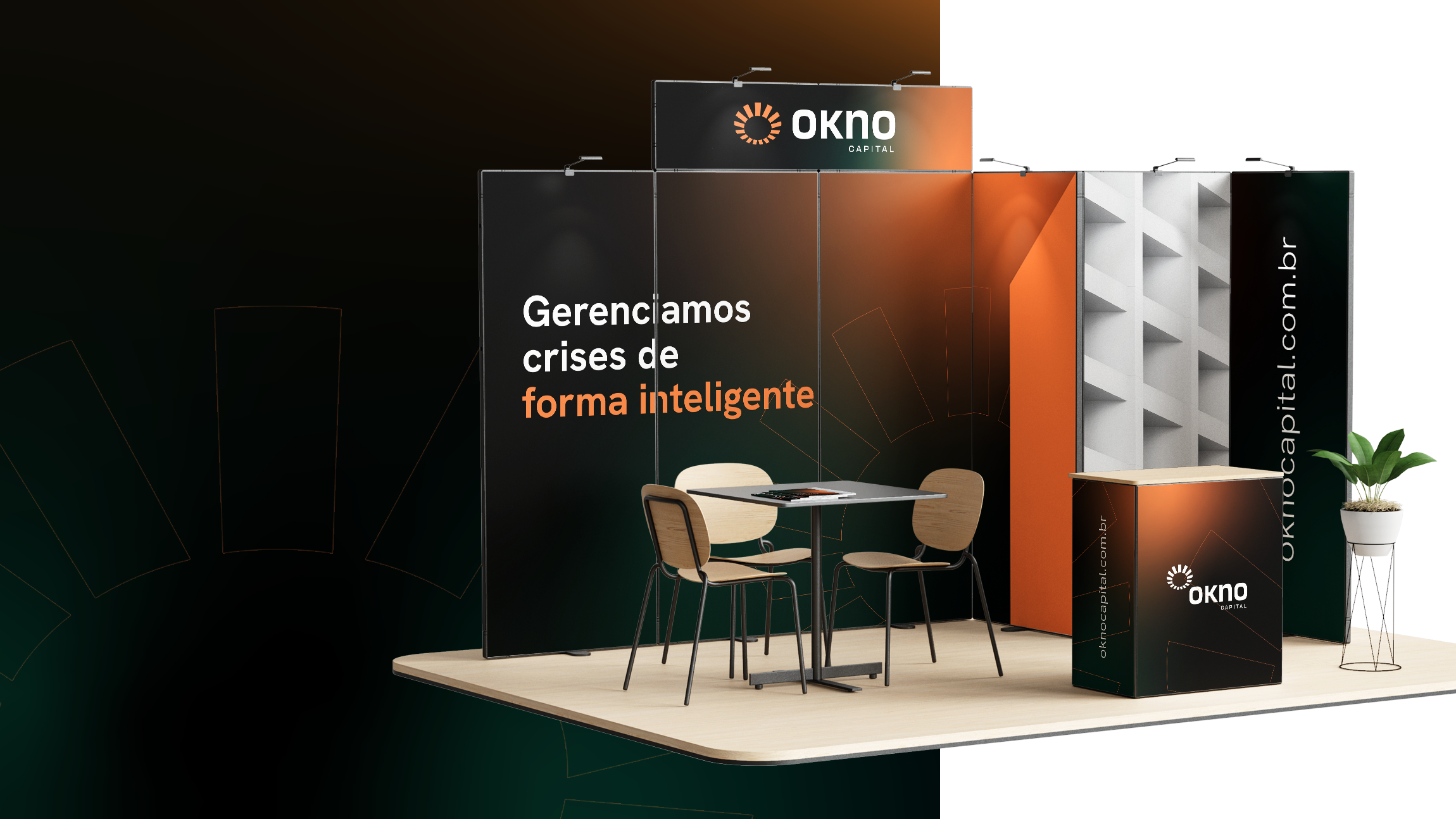
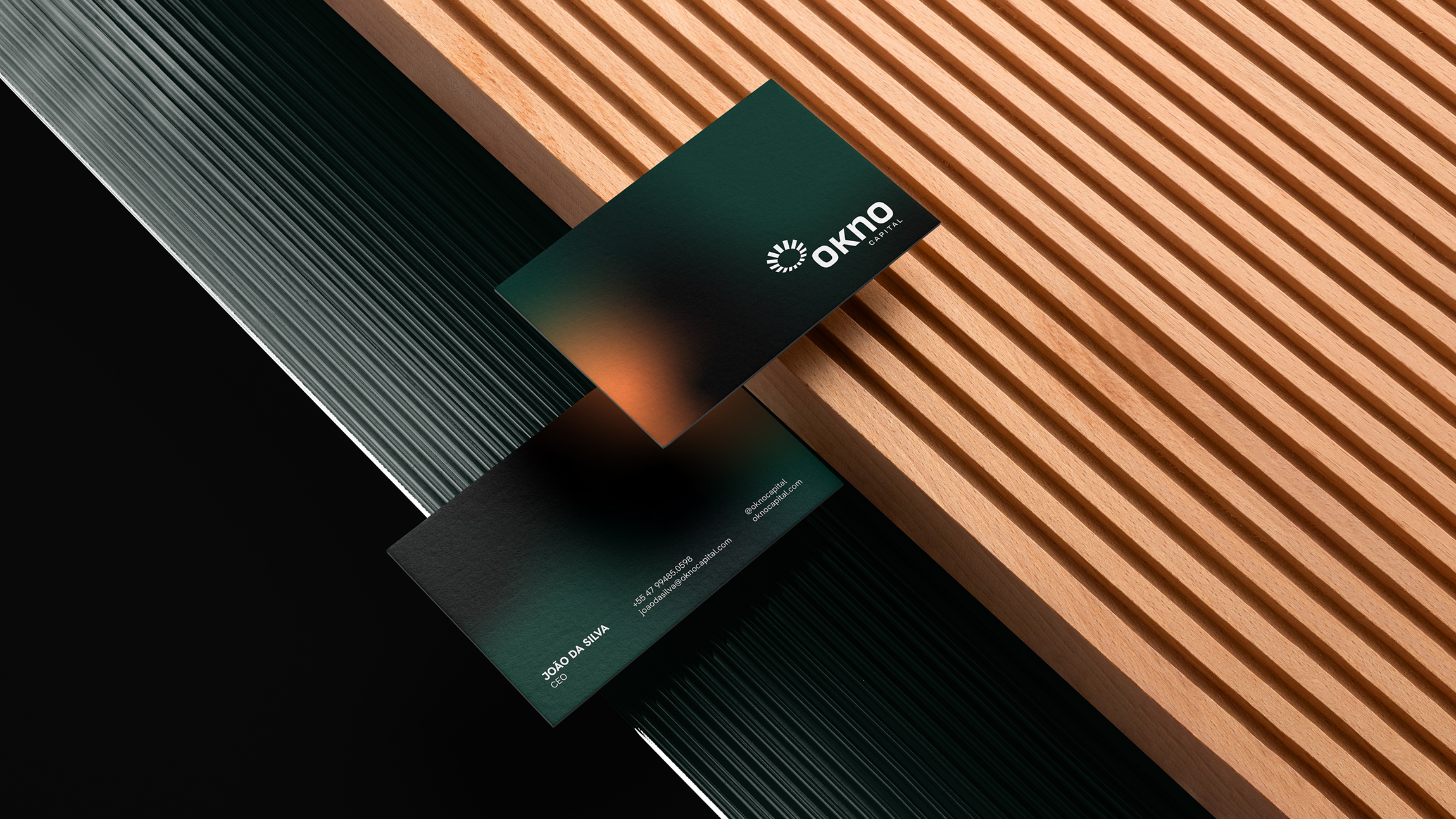
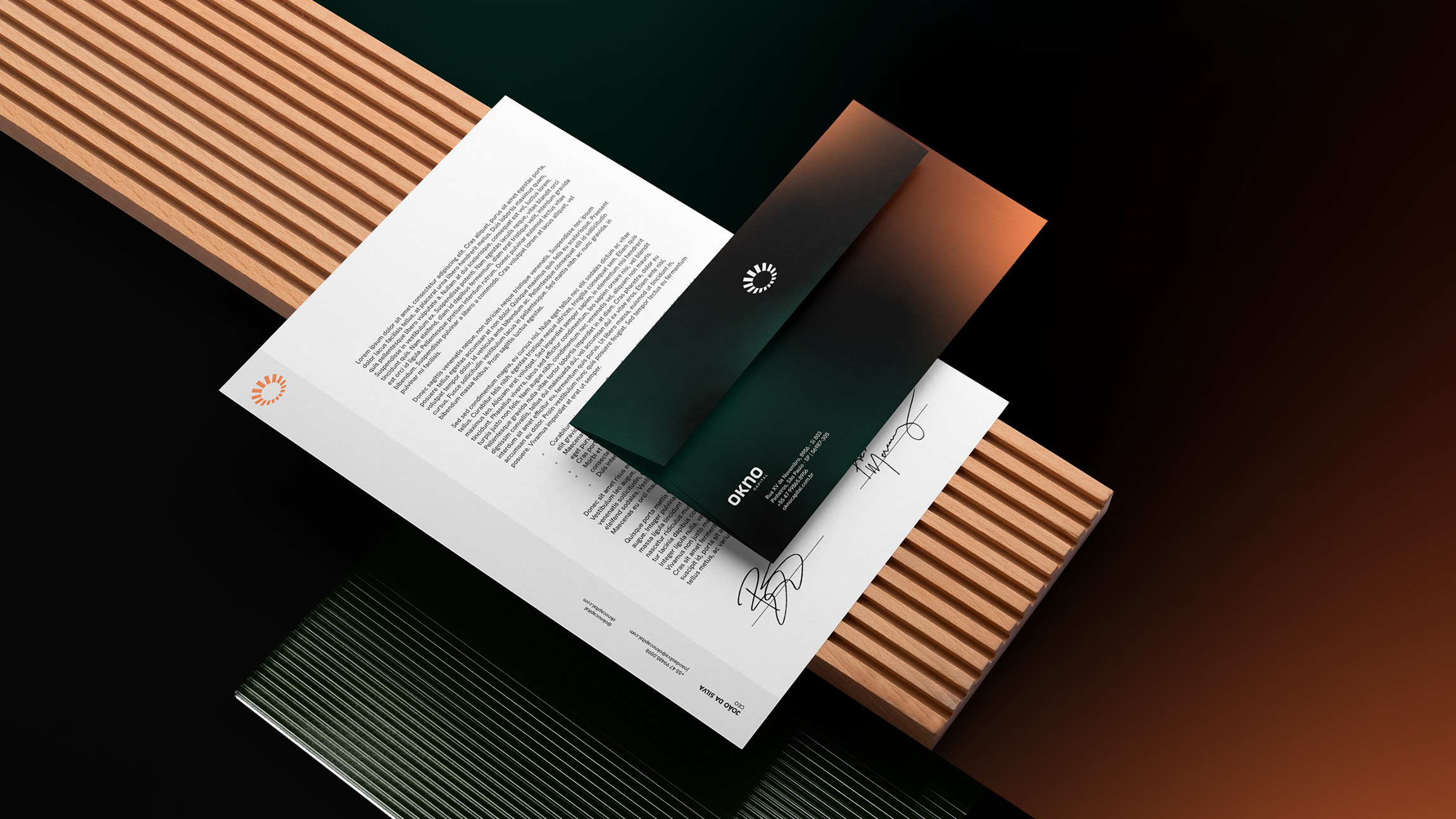
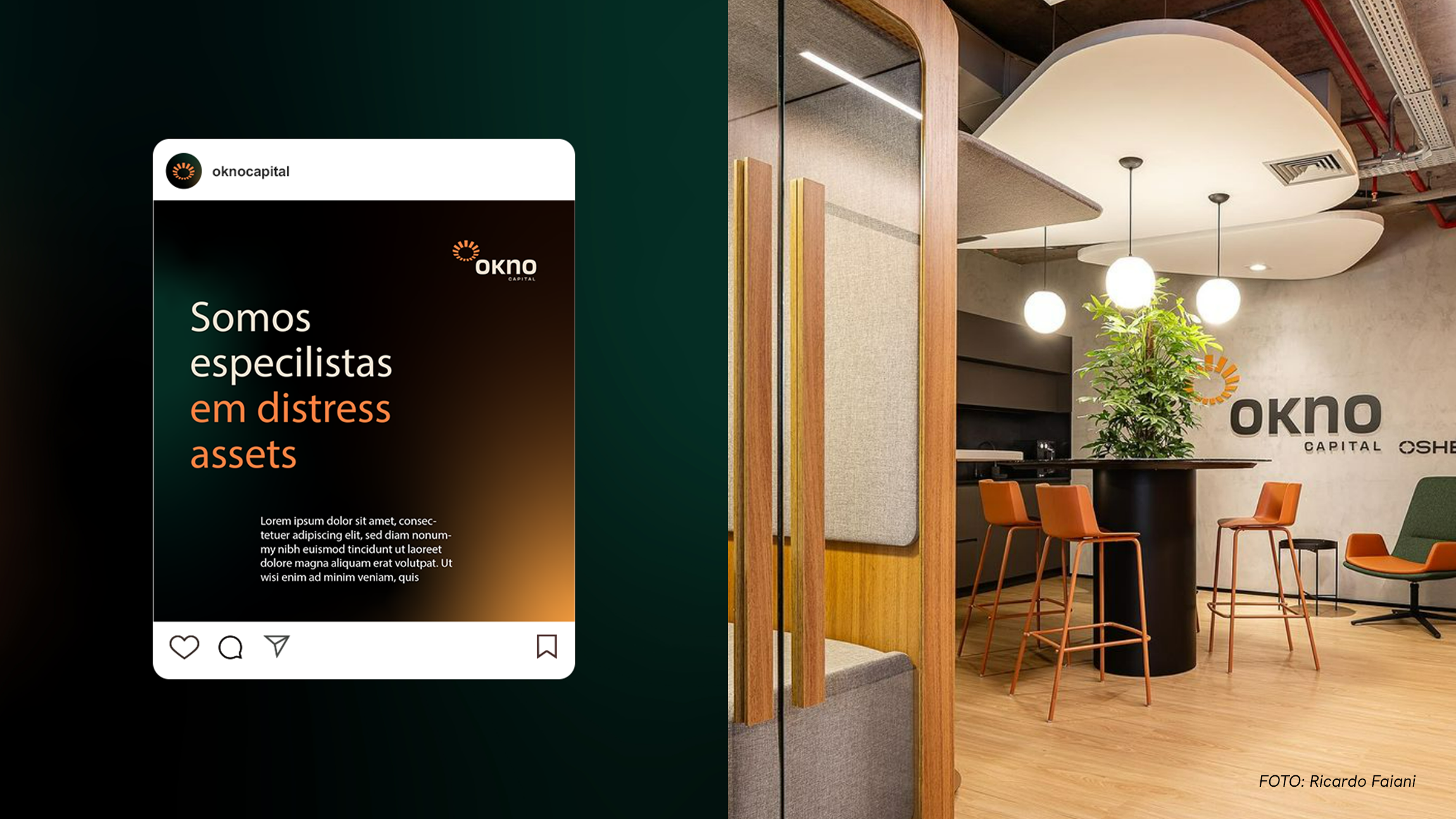
The visual identity further expanded on the concept of new perspectives and the positivity inherent in the brand's promise, using elements such as sun rays and diffuse gradients that evoke the idea of transition.

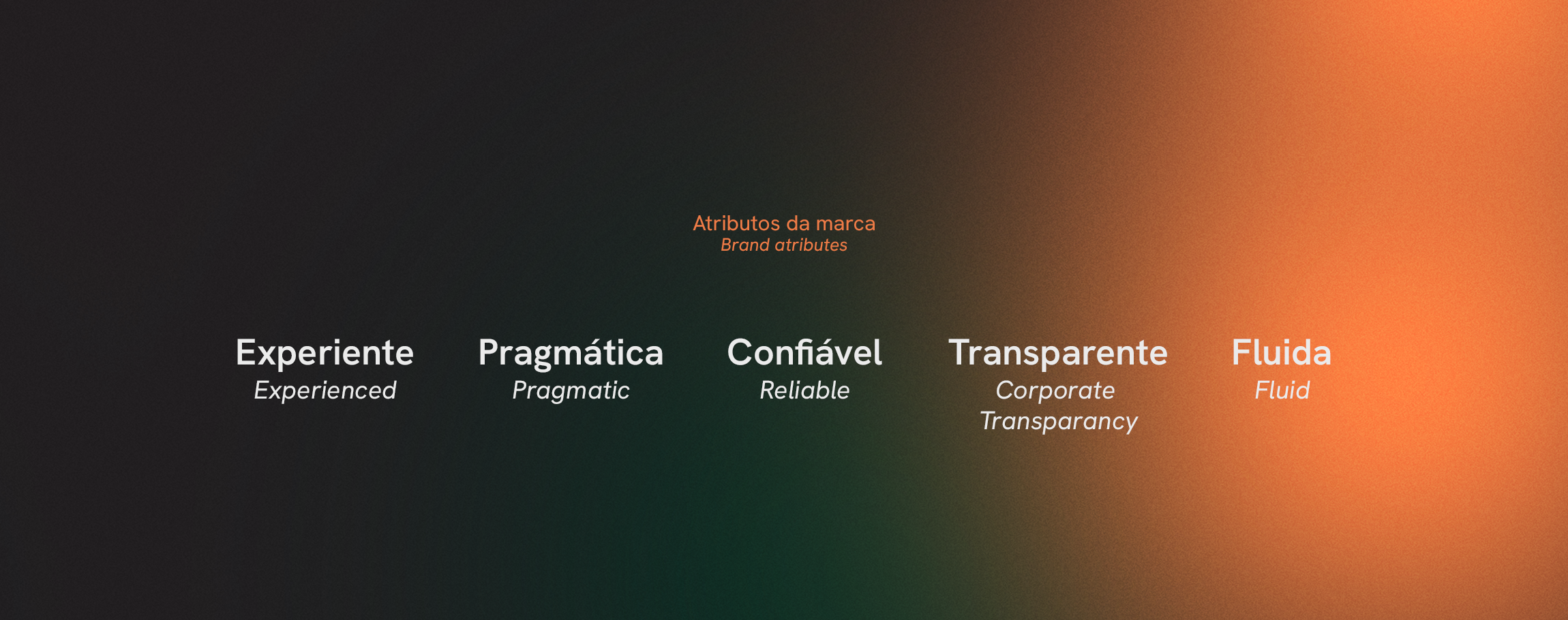
Okno is a brand that evokes new perspectives, by combining attributes such as expertise, lightness, trust and positivity.

View more projects

Year: 2023
Client: Okno Capital
Naming: Pedro Cizoto e Ana Megda
Brand Strategy: Pedro Cizoto
Art Direction: Rafael Busmayer
Design: Rafael Busmeyer, Ana Cosso