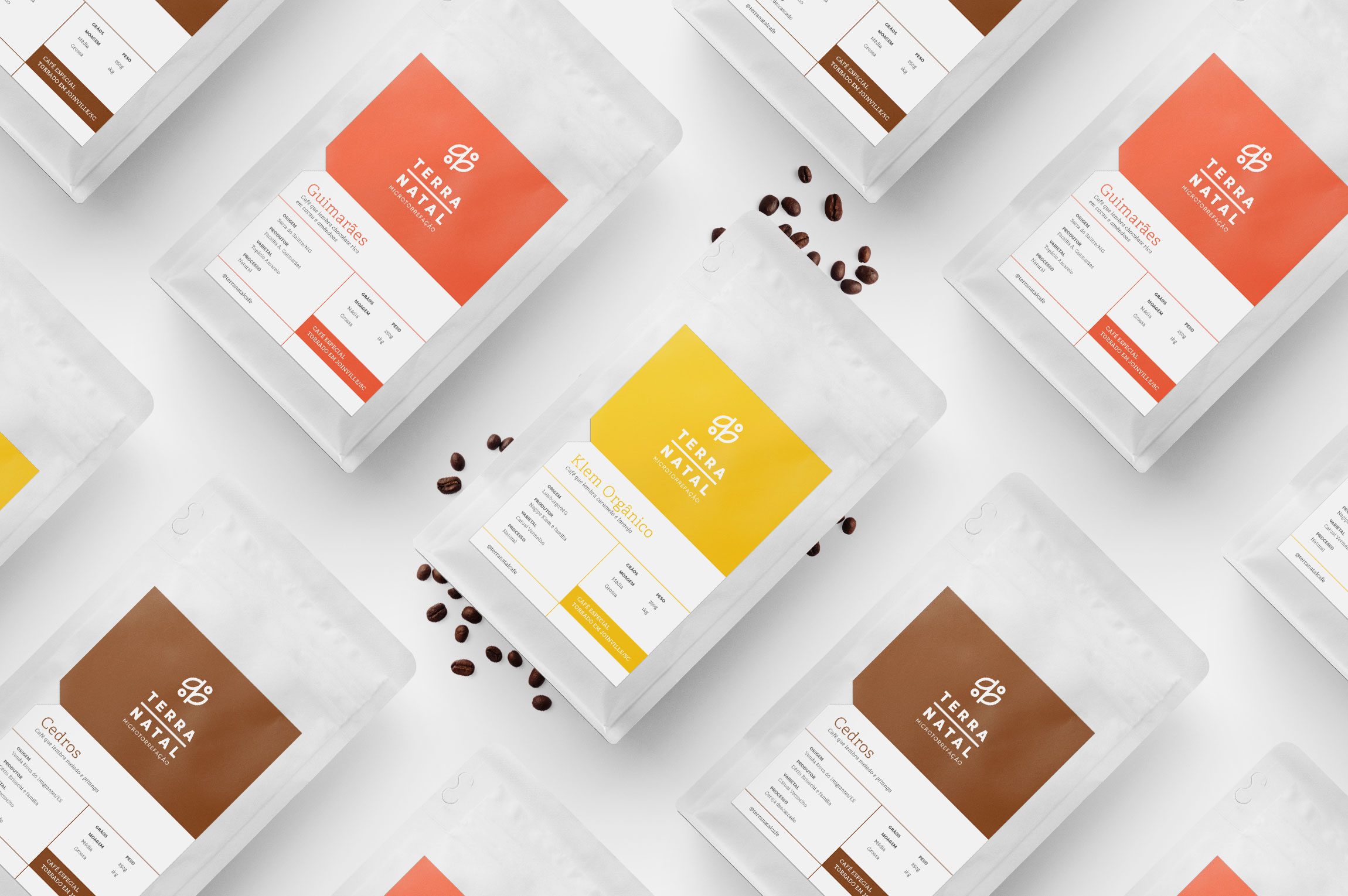
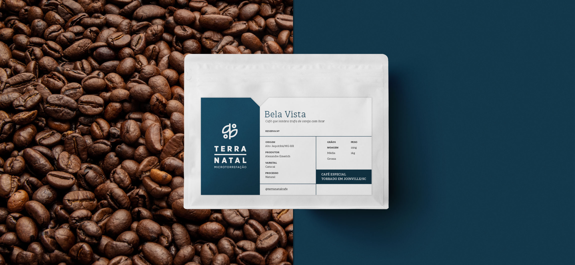
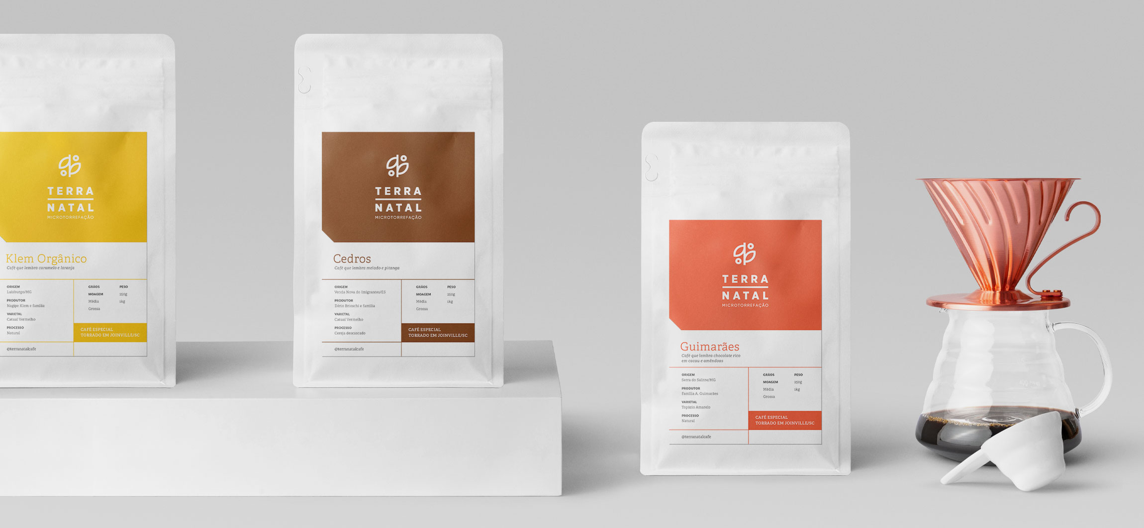
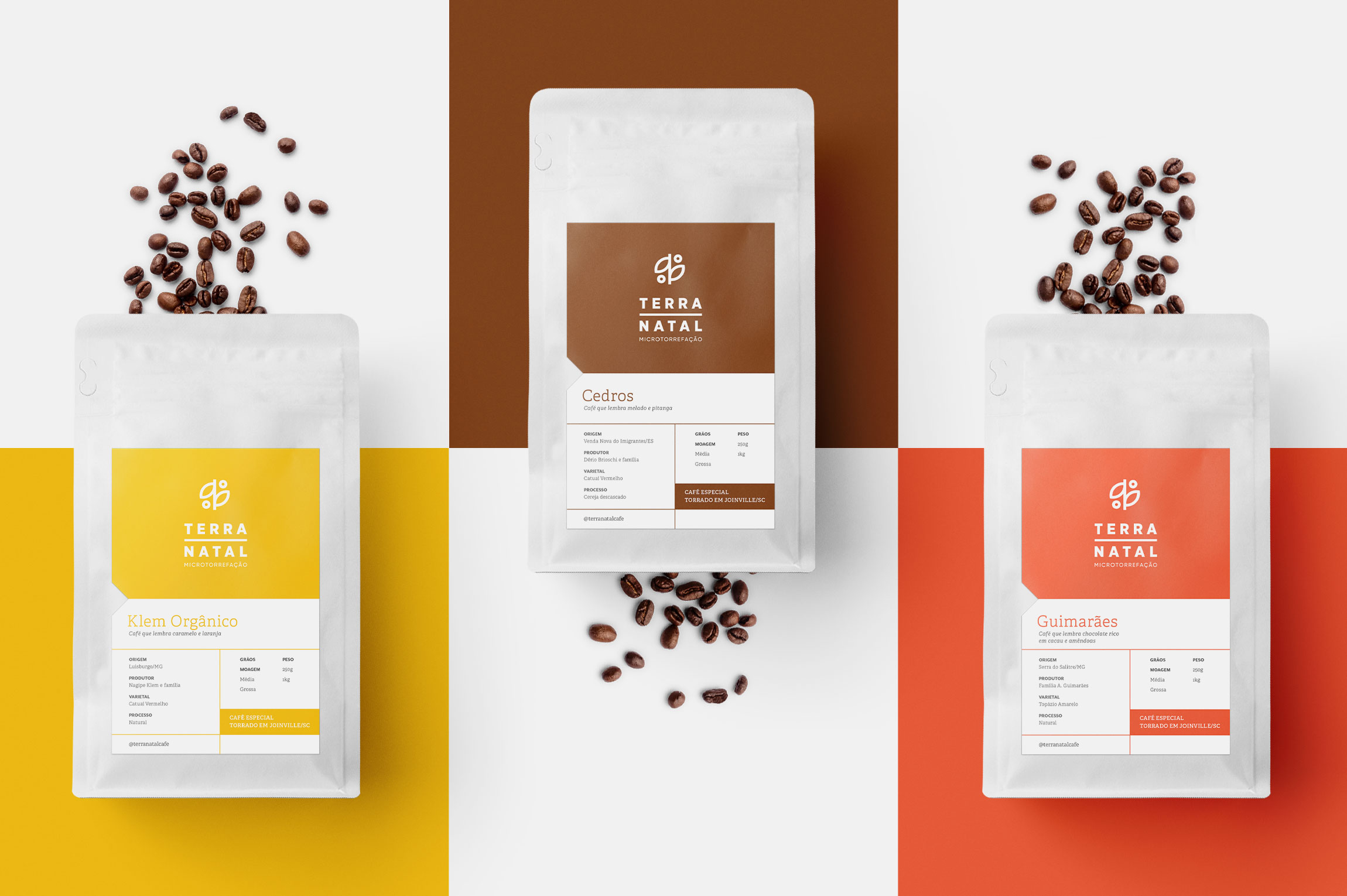
Packaging for Specialty Coffee

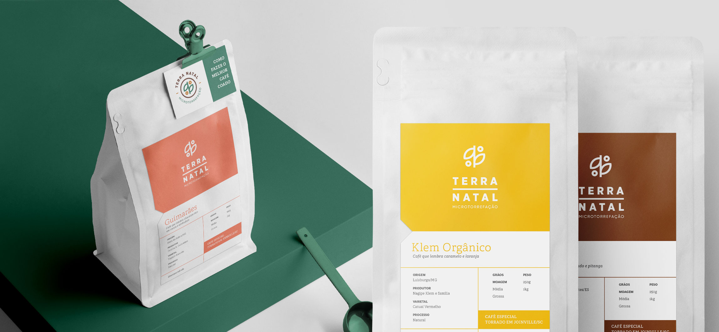
This packaging redesign for specialty coffees at Terra Natal – Torrefação de Cafés focuses on generating a more direct visual identification with the brand, categorizing product lines, informing consumers of sensory characteristics and optimizing production processes.

"The new packaging design focused on communicating the descriptions of each coffee efficiently, placing greater emphasis on the role of micro roasting, creating hierarchies and different presentations for the product lines."

Learn more about the project

Products in constant motion

Unlike industrialized coffees that have a standardized profile, the specialty coffees offered in a micro-roasting facility such as Terra Natal are subject to sensory variations according to the harvest, its processing and the roasting profile adopted. These are the characteristics that make the product unique, alive and in constant transformation.

The challenge of the new packaging design focused on communicating the descriptions of each coffee efficiently, placing greater emphasis on the role of micro-roasting, creating hierarchies and different presentations for the product lines.

Minimalist and energy-packed packs

For the line of regular coffees, Estúdio Siamo kept the craft pack, adopting a young and energetic color palette, associated with the spirit of the brand and its founders. The minimalist design and solid colors also help to quickly identify the products and their origins.

As for the Reserve line, made up of micro-batches and coffees with limited production, the solution included a matte white Horizontal pack, adding even more value to the product. A field indicating limited lot numbering was added, ensuring greater visibility for the product's sensory attributes.

Operational optimization

In addition to the visual change, the operational process was facilitated and optimized, reducing the steps of sticking labels and allowing to define some information by hand, such as type of milling and batch. The functional characteristics of the packaging were also preserved, protecting the product from light and humidity.

This packaging project seeks to convey the simplicity of elements, the care and excellence of the brand with its products, processes and people, from the farm to the cup.

View more projects

Year: 2019

Client: Terra Natal Torrefação de Cafés

Art Direction: Ana Megda

Design: Rafael Busmayer