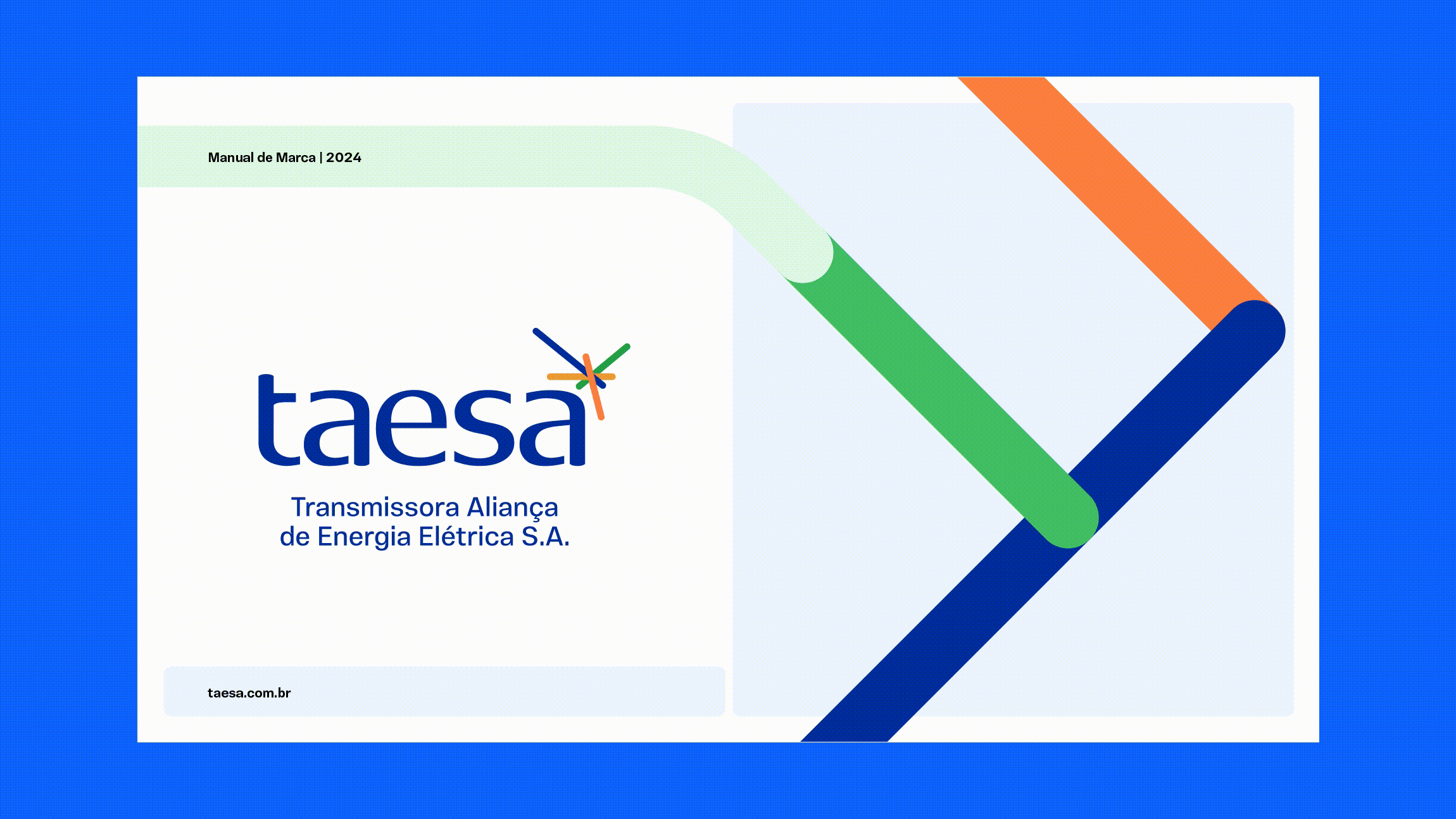
TAESA Branding
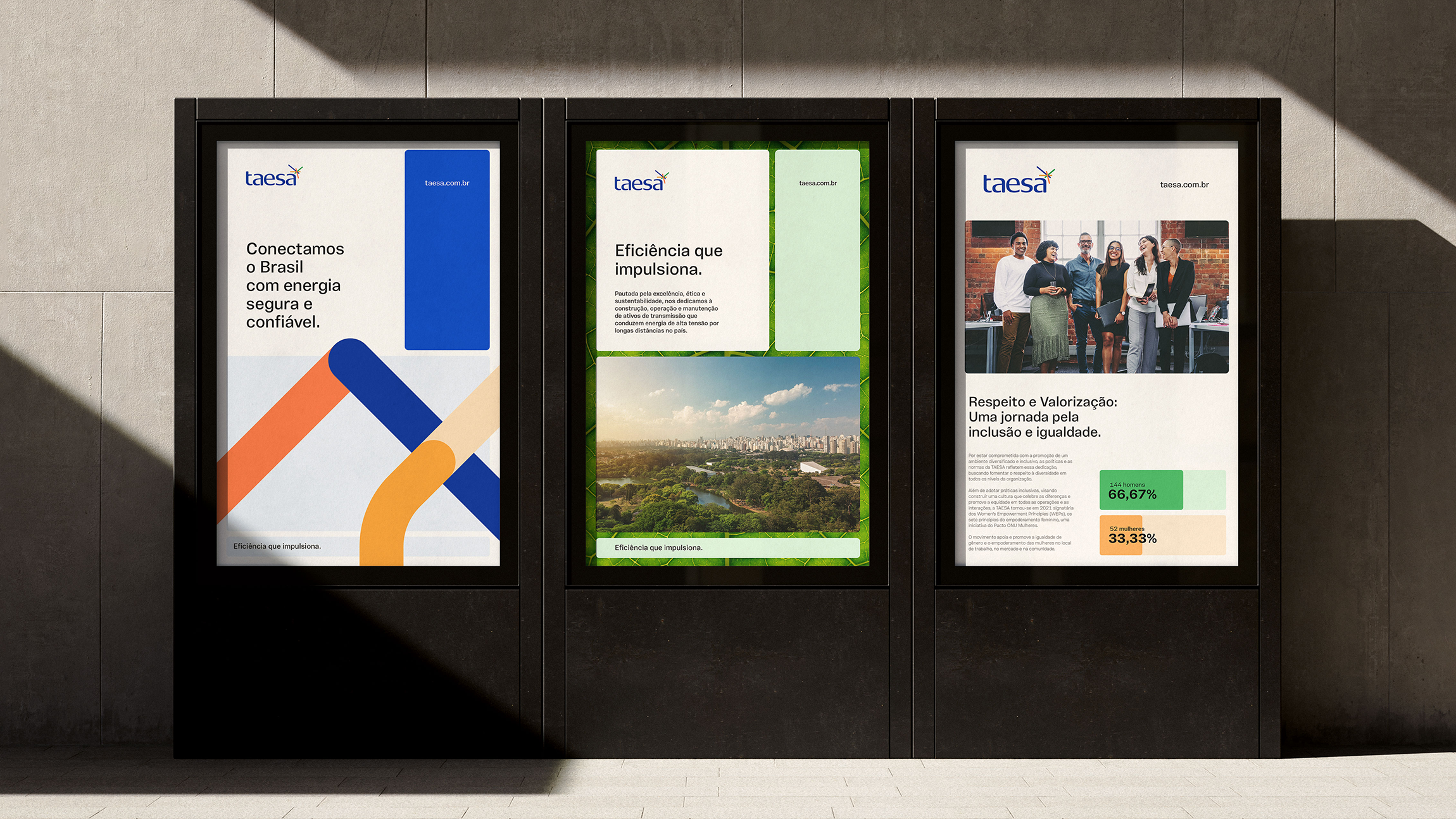
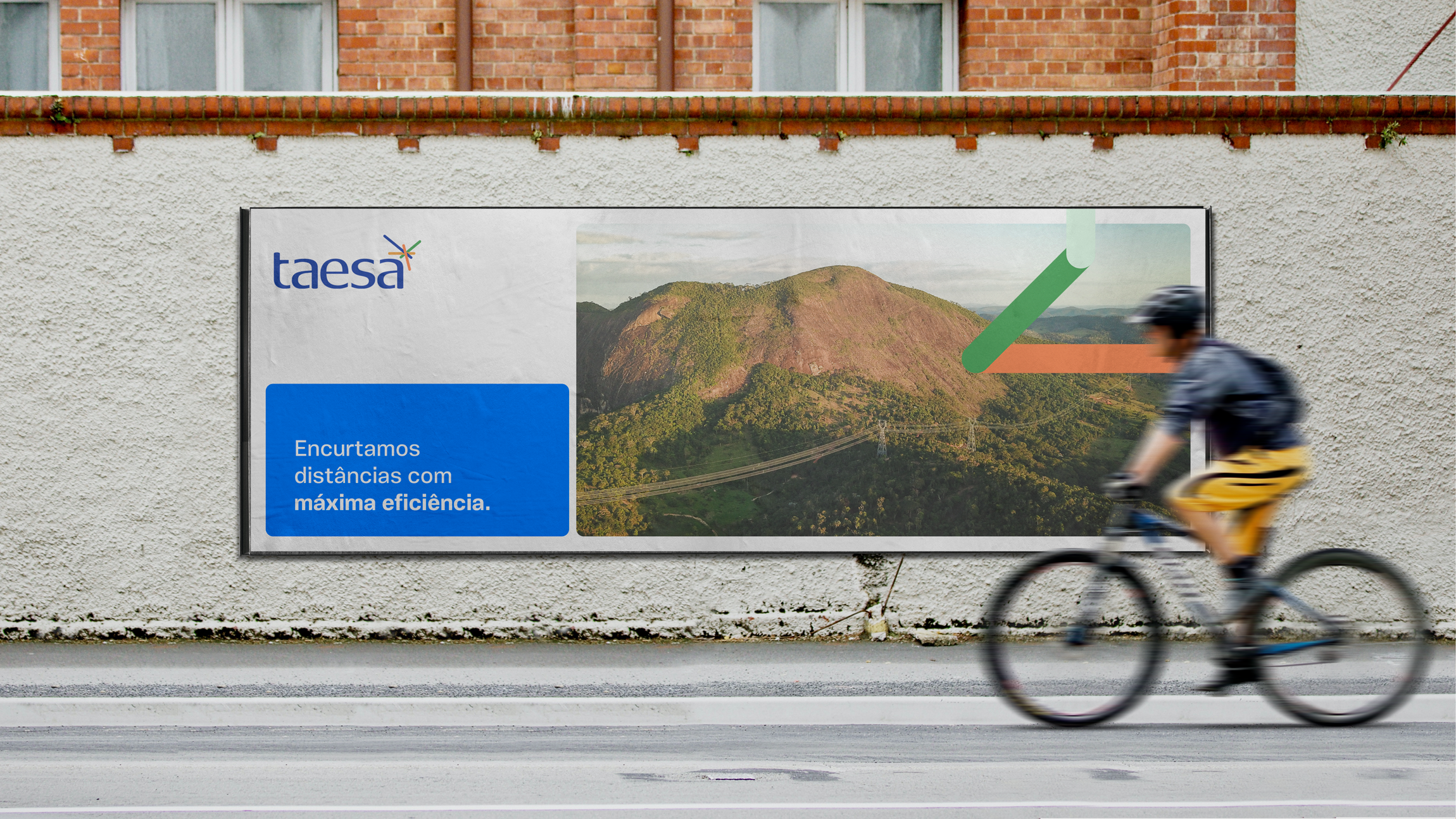
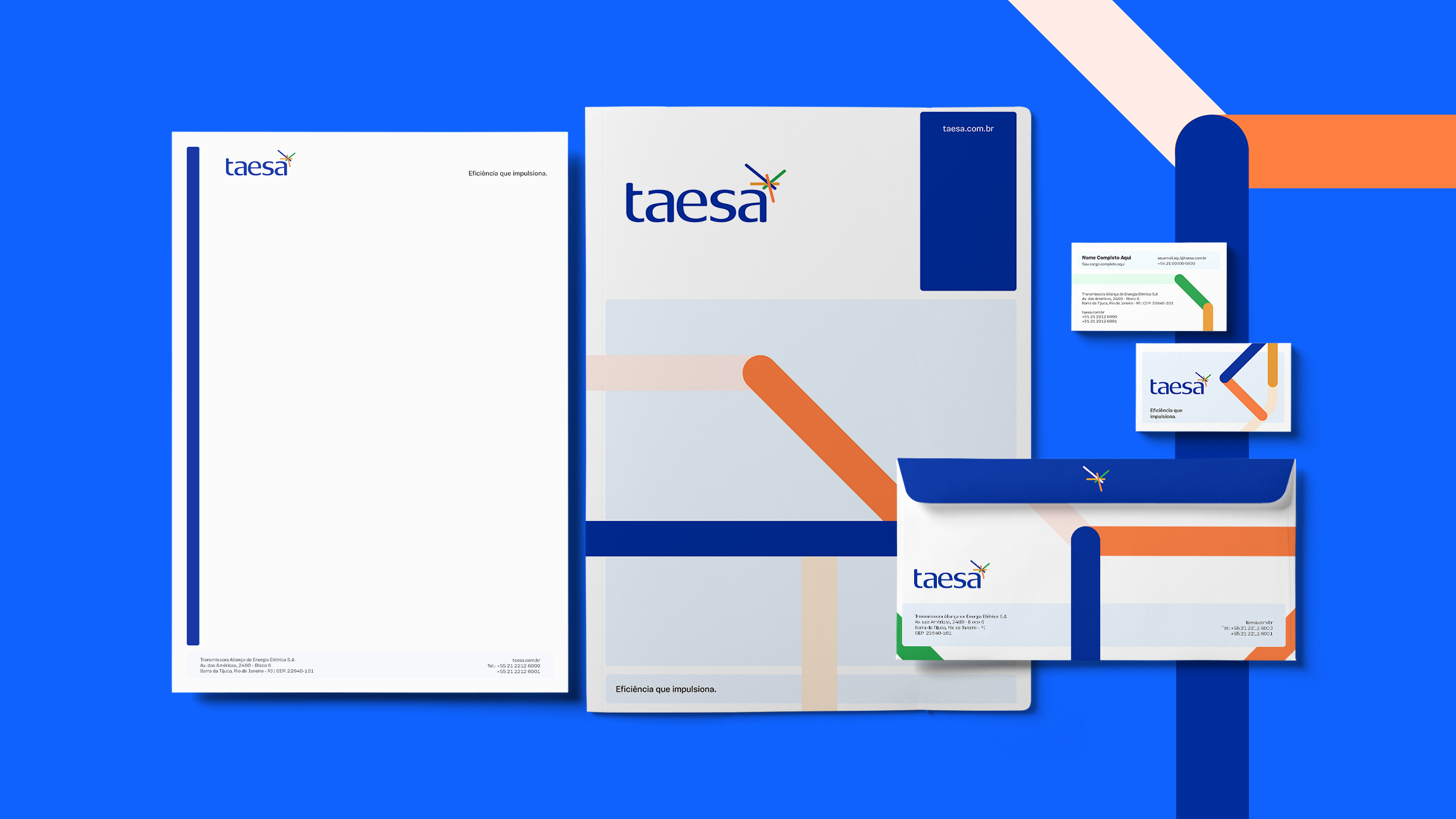
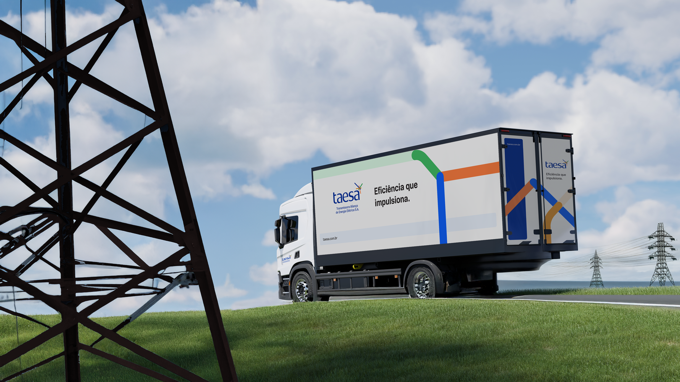
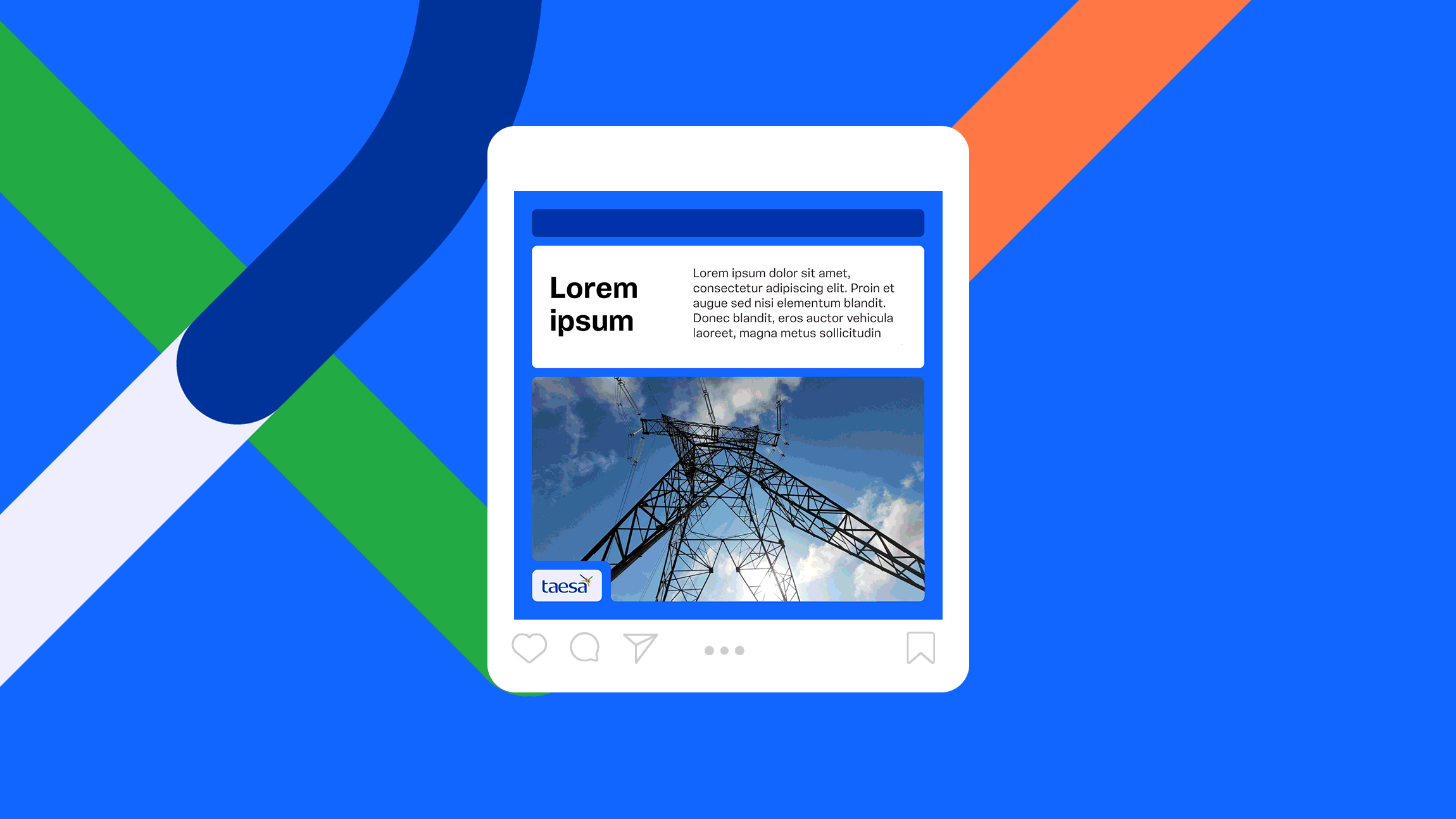
Fluid and dynamic lines that symbolize connection, modernity, and efficiency in this power transmission company.


TAESA is one of the largest private electricity transmission companies in Brazil, with over 15,000 km of transmission lines operating across the entire country and a publicly traded presence on the stock exchange.
In 2024, Siamo Studio was invited to lead a brand evolution project that involved a strategic repositioning, the creation of a new verbal identity, the development of a more contemporary visual system, and the design of a comprehensive set of assets and guidelines to support the company’s communication and brand activations.
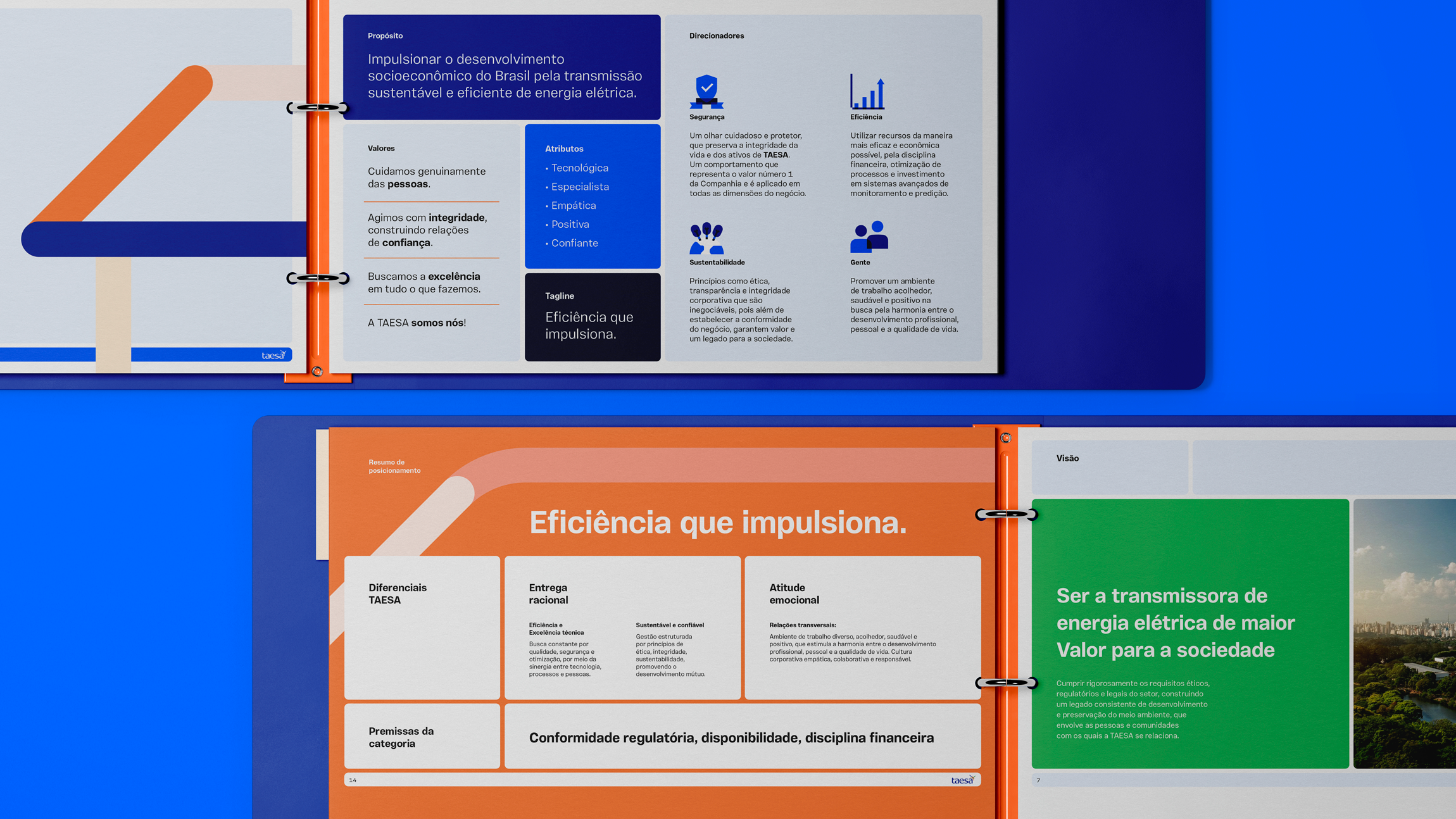
Through an in-depth immersion into TAESA’s culture and DNA, a central insight emerged: the company embodies a rare balance within the sector. On one side, an unwavering drive for technical excellence, operational efficiency, and reliability. On the other, a human-centric mindset, deeply concerned with relationships, legacy, and the environmental and social impact of its operations.
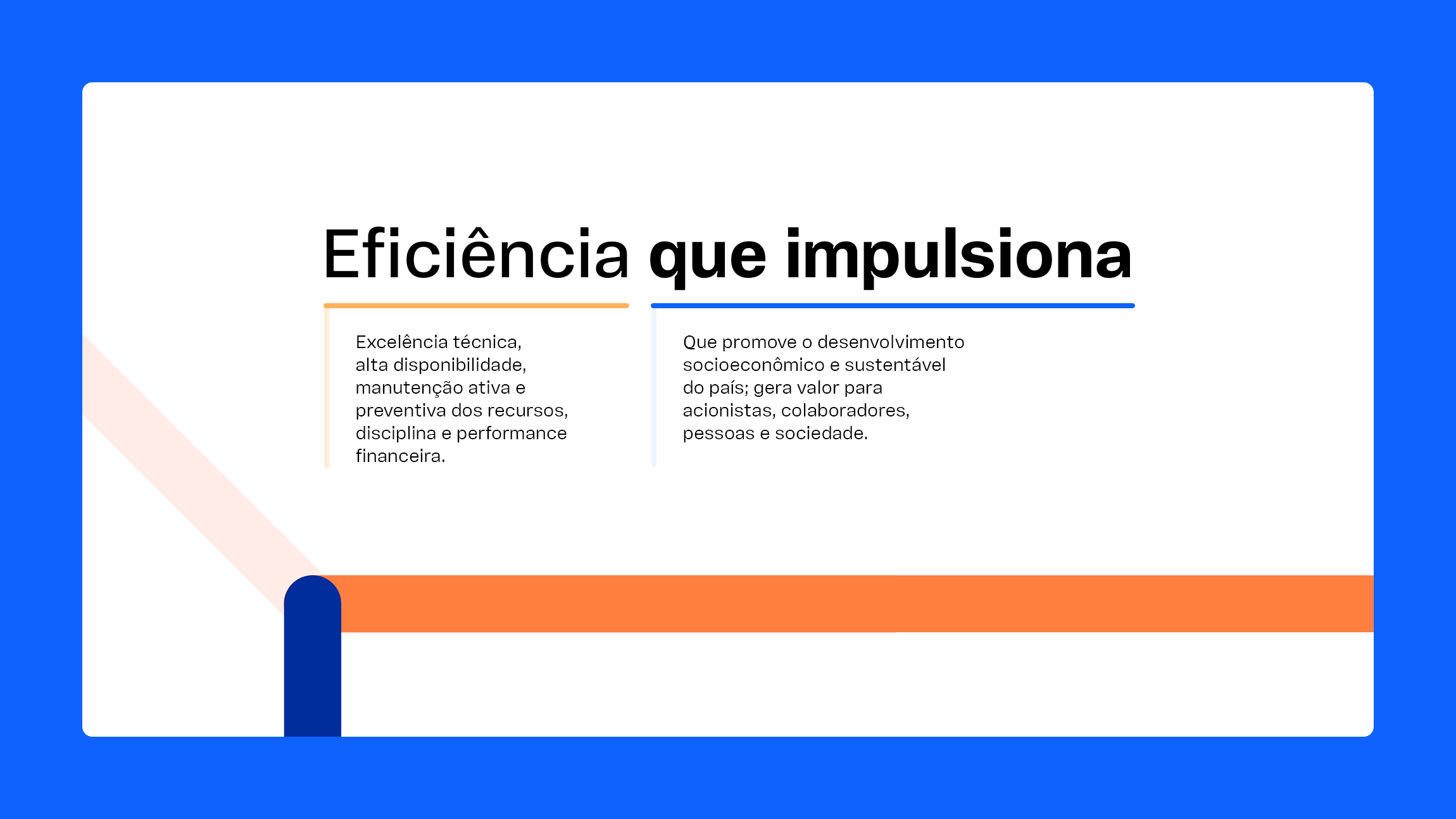
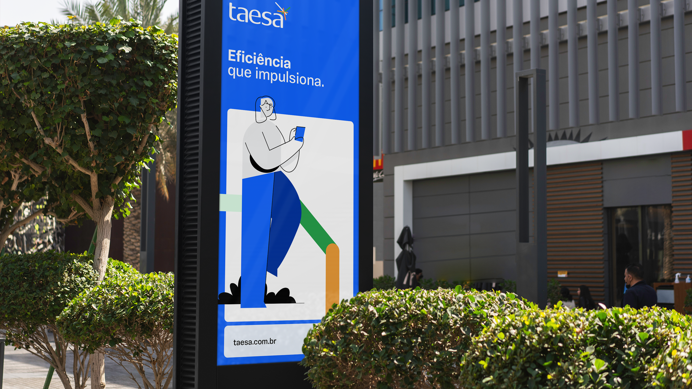
The result of this new phase — captured in the new tagline “Efficiency that drives progress” — is a brand that feels more vibrant and in tune with the spirit of the times. An identity that reflects the technical performance essential to Brazil’s electrical infrastructure as well as TAESA’s commitment to a more conscious, responsible future—aligned with the expectations of its employees, clients, and shareholders.
A creative concept inspired by connection and operational efficiency—key differentiators in a sector defined by regulatory standardization.
Year: 2024
Client: TAESA
Brand Strategy & Copywriting: Pedro Cizoto
Art Direction: Rafael Busmayer
Graphic Design: Ana Dornelles, Rafael Busmayer