

How infographics and data visualization can be applied to compile complex information in a light, didactic and interactive way.
We live in a hyperconnected society constantly bombarded with information. As a natural defense, we tend to filter and ignore what we deem irrelevant or confusing, creating a selective funnel for what we actually accept to absorb into our daily lives.
As a result, the effectiveness of the communication process depends not only on the theme of the content, but also on the format and strategy adopted to transmit the information.
In this context, features such as infographics and data visualization provide audiences an interactive and fun format to consume something more complex.
Using an infographic to tell stories
An infographic is a collection of streamlined images, graphics, and text that provides an uncomplicated, condensed view of a subject.
This resource has been explored for a long time in the areas of science, history books and journalism, as a way to provide more efficient information..
In the universe of brands, there are many application possibilities, including processes and other complex information. As the format presupposes the interaction of graphics and text, it is ideally planned and developed in partnership with a designer and a copywriter.
One of the main advantages of infographics is its interactive nature, allowing adaptations for printed situations (in books, magazines, folders and similar) or digital (such as websites, hotsites, apps and videos).
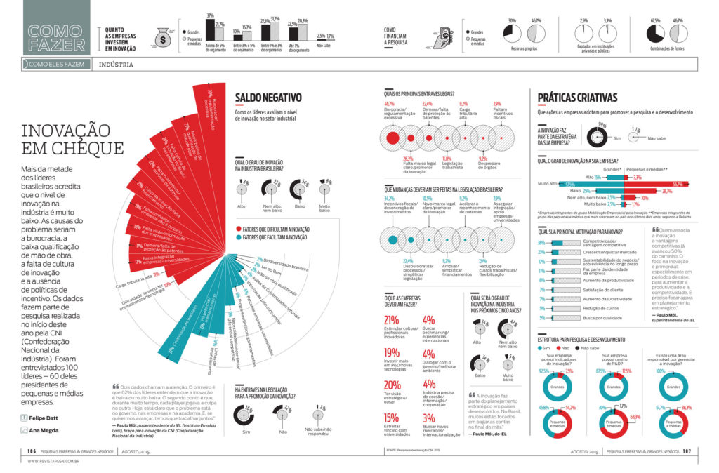
Using Data Visualization to highlight complex information
Data visualization is a communication tool that consists of analyzing, processing and expressing data in a visual way. For this, it uses different resources and elements such as tables, graphs, maps, texts and diagrams.
The application of Data Visualization in society involves politics (analyzing social phenomena, for example), science (as in the study of diseases), traffic engineering, statistics, among many other applications.
Its use in the universe of brands can cover a series of contexts and needs such as reports, research results, statistics and projections.
In its first stage of development, raw and unordered data (such as a spreadsheet, for example) is analyzed, filtered and sorted. This treatment is essential to create the hierarchy and the path on which the data must be shown.
Then, the designer develops the layout according to the channel – which, like infographics, can be printed or digital.